Just My Case Custom Phone Case Website
Project Overview
The problem:
Adults aren’t given many choices for customizing phone cases online that are fast and easy.
The goal:
Design a website for Just My Case that allows users to quickly and easily create a custom phone case for their phones.
The product:
Just My Case came from the need to make it easier for all people to be able to custom create and design phone cases that were as unique as the individual. The website’s goal is to provide the best products to its customers and also be able to bring a creative outlet right to their fingertips.

My role:
UX designer & UX researcher designing a website for Just My Case from customization to checkout.
Responsibilities:
User research consisting of conducting interviews, paper and digital wire framing, low and high-fidelity prototyping, conducting usability studies, accounting for accessibility, and iterating on designs.
Type of Project & Project duration:
This was a project done through my Google UX Design Program to receive my professional certification.
October 2021- November 2021
Understanding the User
I conducted interviews and created empathy maps to understand the kind of users that I’m designing for and what they need. One of the user groups that was identified through research was busy, working adults who want to bring their personal style into their life through accessories since they often have to adhere to a dress code in the work setting.
Going into this research it was assumed that there would be constrains such as time and navigation when using customization apps and that was revealed to be true. There were also additional pain points revealed such as the need for available pre made options to help those that are not as artistic of mind and a need for accessibility as well.
User Research: Pain Points

Persona & Problem Statement
Petra is a busy working corporate paralegal who needs to order custom phone cases quickly and easily that will fit her personal style because although she has a dress code, she still wants to show individual style through her phone and accessories.

User Journey Map
By mapping Petra’s user journey, it was shown that it would benefit the user to have a website to order custom phone cases fast and easily.

Starting the Design
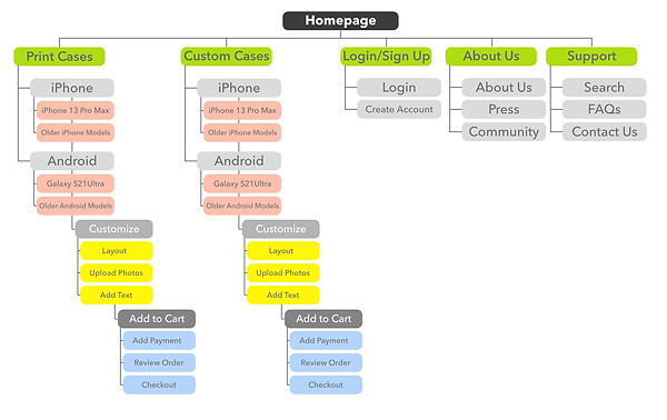
Sitemap
Navigation seemed to be a central pain point for users so I really wanted to set up sections that made sense and guided users accurately. However, the site map changed and condensed over the course of user testing to bring all of the case options into one area for even easier navigation.
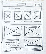
Paper Wireframes
I sketched out paper wireframes for each screen in my app, trying to factor in the user pain points about the need for streamlined layouts and easy navigation.
The 5 paper wireframes together show different versions of the same home screen and the single wireframe shows the new, refined version.


Digital Wireframes
When I went from paper to digital wireframes I continued to focus on the importance of navigation as well as layout and common regions.
The placement of a navigation bar and visual elements were some ways I aided in that focus.

screen size variation(s)
I adjusted placement and layout from device to device so that images and information were still clear, sectioned correctly and structured.

Low-Fidelity Prototype
To create a low-fidelity prototype, I added connections from one screen to the next based on the user flow of customizing a phone case, adding to cart and checking out. I also added connections to allow users to jump back to the home page or visit login, their cart or About Us pages from anywhere in the user flow.

Usability Study: Parameters
Study type:
Unmoderated usability study
Location:
United States, remote from each participant’s home
Participants:
5 participants
Length:
15 minutes
Usability Study: Findings
These were the main findings of my usability study:

Refining the Design
Mockups
Based on the insights from the usability study, I changed the “x” button to a “continue shopping” button so that users could more clearly understand that their cart would not be emptied if they pressed that button and allowed them to be brought back to the model options page and order additional items if needed.
Based on the insights from the usability study, I added in the pre made print section of options laid out for users who needed additional creative help to start the customization process.


Final Mockups


Mockups: Screen Size Variations
I wanted the Just My Case website to be responsive on mobile devices so I worked on digital mockups of the mobile device layout based on my earlier wireframes. I adjusted placement so that images and information were clear, common regions were still understood and layout was still structured.

High-Fidelity Prototype
To create a high-fidelity prototype, I added the same connections from my previous low-fidelity prototype as well as adding the additional connections needed once I made the page and button additions and changes from the usability study.

Accessibility Considerations

Going Forward
Takeaways
Impact:
The website allows users to get to their goal of creating customized phone cases and ordering them.
Users shared that the design was easy to navigate through, guided them through the process with visual elements and displayed clear common regions that allowed them to decide where to go throughout the website.
What I learned:
While researching and designing the Just My Case website, I learned that layout and visual elements are key to guiding users through a website. Throughout the process, both with usability studies and peer reviews, it became clear that the user and their needs have to be the driving force behind my designs and decisions when iterating on those designs to ultimately create a successful creation for both parties.
Next Steps
