Grow Speech Teen Public Speaking Tutoring Web & Mobile App
Project Overview
The problem:
Teens today can be insecure and scared to speak up in their ever growing world of social media and other pressures. Some even deal with anxiety. The Grow Speech team has seen the lack of public speaking being taught to teenagers and that it often leads to young adults who have a harder time getting their voices heard for future opportunities.
The goal:
Design an app that provides tutoring to teens growing them into empowered speakers who can use their voices towards expression and future goals and to teach through fun, activity-based curriculum focused on nurturing every voice. These teens can then go out into the world, prepared and confident, and become positive members of their society.
The product:
Grow Speech is an app and website dedicated to preparing teens for public speaking. They are committed to coaching teens into empowered speakers who can use their voices towards expression and future goals. They teach through fun, activity-based curriculum focused on nurturing every voice.
My role:
Lead UX designer & UX researcher leading the app and responsive website design for Grow Speech from concept to delivery.
Responsibilities:
User research consisting of conducting interviews, paper and digital wire framing, low and high-fidelity prototyping, conducting usability studies, accounting for accessibility, and iterating on designs.


Type of Project & Project duration:
This was a project done through my Google UX Design Program to receive my professional certification.
November 2021-December 2021
Understanding the User
I conducted interviews and created empathy maps to understand the kind of users that I’m designing for and what they need. One of the user groups that was identified through research was busy, working students who were looking to get tutoring in a style and structure that worked within their schedules.
Going into this research it was assumed that there would be constrains such as program customization and navigation and that was revealed to be true. There were also additional pain points revealed such as the need for more functional components and a need for accessibility as well.
Personas & Problem Statements
Toby is a working high school student who likes a more quiet and connected learning environment who needs to order a tutoring program quickly, easily and that works with his busy schedule because he wants to become a better public speaker for future job and college opportunities.

Lexi is a busy, hardworking high school student who enjoys learning & growing her skills in a group setting who needs to complete her order of a tutoring program fast and easily because she wants to start getting the most out of the tutoring tools to put towards any future speaking engagements and scenarios.

Competitive Audit
Here I have an audit of a few competitor’s products provided information on both gaps in the market as well as the opportunities to be able to address in the Grow Speech app and website.

Ideation
I did a quick crazy eights ideation exercise to come up with ideas for how to layout my tutoring app and website. I focused on driving the testimonials of those who have used the product as well as displaying the types of programs offered.

Starting the Design
Digital Wireframes
My focus was the importance of clear navigation through the mobile app. I wanted to create multiple points of entry for users to the product of which tutoring programs to choose.
The placement of the hamburger menu icon and call to action button were some ways I aided in that focus.

Low-Fidelity Prototype
To prepare for my usability test, I created a low-fidelity prototype that connected the user flow of choosing a tutoring program and enrolling into it.

Usability Study: Parameters
Study type:
Unmoderated usability study
Location:
United States, remote from each participant’s home
Participants:
5 participants
Length:
15 minutes
Usability Study: Findings
These were the main findings of my usability study:

Refining the Design
Mockups
Based on the insights that most users wanted a way to return back to the different program options page, I added an “X” button to be able to let users get back to previous page to view all program options.


Final Mockups

High-Fidelity Prototype
The high-fidelity prototype follows the same user flow as the previous low-fidelity prototype. However, this also includes all design changes and additions I made after the usability study.
View the Grow Speech high-fidelity prototype

Accessibility Considerations

Responsive Design
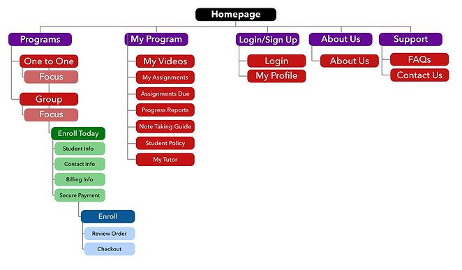
Sitemaps
With the app design completed, I began working on the responsive website. I created the sitemap to organize the structure of navigation through the site and ensure that it is just as consistent and easy to navigate across devices.
Responsive Designs
My goals for the different screen sizes were that they would be structured so that the design would fit the particular user needs of each device and screen depending on what they were using.

Going Forward
Takeaways
Impact:
The app and website allowed users to get to their goal of enrolling into a customized tutoring program that worked for them, quickly and easily. Users shared that the design was easy to navigate, guided them with visual elements, and displayed clear call to action buttons that allowed them to flow through the enrollment process. One quote from a user was ”the app helped me be able to customize my learning experience simply and without compromising my learning style.”
What I learned:
I learned that interviewing and gathering research really helps to get to who the user really is and what they actually want and need in this type of app and website. Designing towards a cause for good showed me that empathy is what is needed at the forefront of my designing all throughout their different iterations.
Next Steps
