Fedcomp Marketing Website
Project Overview
The problem:
Client wanted the Fedcomp marketing website to appear more clean, modern and updated in it's design and wanted the user to be able to navigate the site with more simplicity and enhance the user engagement with content.
Client's goals:
-
Marketing website redesign
-
Modernize and elevate the website's appearance and simplify website pages
-
Improve clarity and user navigation
-
Implementing the client's new branding elements consistently across the website
Before:
-
An outdated website
-
Cluttered website layout
-
Too much text on pages
-
Cluttered and hard to navigate
-
Dated interface
After:
-
A fresh, modernized website
-
Clear, user-friendly pages
-
Cohesive branding throughout
-
Streamlined content
-
Well-structured, easy-to-use marketing site
-
Contemporary, user-friendly design
My role:
UX designer
Responsibilities:
Designing each website page. Iterating on designs and creating a cohesive outcome throughout the website.
Website:
Understanding the User
User Research: Pain Points

Starting the Design
Sitemap
Navigation being a central pain point for users, it was key to simplify the sitemap down to what is shown below. Multiple ways to reach important interfaces and calls to action were the central focus in this sitemap structure.

Refining the Design
Mockups
Early mockup designs did not have multiple call to action buttons throughout each webpage. I added those in for more clarity for users. I also utilized different color palettes until ultimately landing on the one shown in the final mockup. I sectioned out the information in different ways to see what best helps with the user flow.


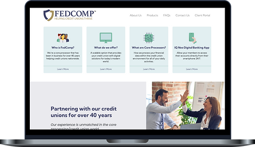
Final Mockups
In the final mockups of the homepage, I landed on the color palette and design elements that suited the client best and then utilized them through the rest of the website pages. Some sections were given more white space and additional call to action buttons were placed throughout the website to guide user through the flow easily. Some pages were ultimately taken out for more clarity and simplicity for the user.

![contact]- Desktop.png](https://static.wixstatic.com/media/5d092d_0bd31a74cb2547f0908e553a94e57079~mv2.png/v1/fill/w_269,h_321,al_c,q_85,usm_0.66_1.00_0.01,enc_avif,quality_auto/contact%5D-%20Desktop.png)
![FAQs-[FAQ]- Desktop.png](https://static.wixstatic.com/media/5d092d_0c69b875698141478fc27494544fe78e~mv2.png/v1/crop/x_0,y_67,w_1440,h_1776/fill/w_269,h_334,al_c,q_85,usm_0.66_1.00_0.01,enc_avif,quality_auto/FAQs-%5BFAQ%5D-%20Desktop.png)
Style Guide
The style guide is a collection of all of the styled design elements, fonts and color palette that dictates the final designs.

Accessibility Considerations

Takeaways
Impact:
The Client was left with a clean, simplified website with clear, user-friendly pages. I kept cohesive branding throughout using imagery and dynamic icons. The user can now move through the site intuitively and have a positive experience while getting all the product information they need.
What I learned:
While researching and designing the Fedcomp Marketing Website, I learned that taking out unnecessary content can bring the user through the user flow with more ease while still creating an engaging site. Throughout the process, communication with client and receiving feedback is critical as well as interpreting that feedback into a well formed layout and user flow in general.