Highland Principals Website
Project Overview
The problem:
Client wanted the Highland Principals website to be more modern & elevated in design as well as more clarity through user navigation. They also want a new logo designed and the website fully rebranded.
Client's goals:
-
Logo & Branding redesign
-
Website redesign
-
Modernize and elevate the website's branding, appearance and simplifying website pages
-
Improve clarity and user navigation
-
Implementing the client's new branding elements consistently across the website

Before:
-
An outdated website
-
Cluttered website layout
-
Too much text on pages
-
Cluttered and hard to navigate
-
Dated branding
After:
-
A fresh, modernized website
-
Clear, user-friendly pages
-
Updated & cohesive branding throughout
-
Streamlined content
-
Well-structured, easy-to-use marketing site
-
Contemporary, user-friendly design
My role:
UX designer
Responsibilities:
Designing new branding for the company and redesigning each website page. Iterating on designs and creating a cohesive outcome throughout the website.
Website:
Understanding the User
User Research: Pain Points

Starting the Design
Sitemap
Navigation being a central pain point for users, it was key to simplify the sitemap down to what is shown below. Client wanted to trim down the clutter and we opted to keep most information to the homepage with header navigation to each section.

Refining the Design
Logo
The client's original logo design did not reflect the style they wanted. I designed the new logo to be more stylized yet keep a modern feel. I also created a new color palette and design elements throughout to bring continuity to the website and a more elevated overall appearance.
Client's Original Logo

Redesigned Logo


Style Guide
The style guide is a collection of all of the styled design elements, fonts and color palette that dictates the final designs.

Mockups
Early mockup designs still contained sections that were not ultimately needed for the user and I would take those out in further iterations.
![]- Desktop.png](https://static.wixstatic.com/media/5d092d_ffce5fda3dc342e4a19d72e2f891518c~mv2.png/v1/fill/w_159,h_727,al_c,q_85,usm_0.66_1.00_0.01,enc_avif,quality_auto/%5D-%20Desktop.png)
![]- Desktop Option 2.png](https://static.wixstatic.com/media/5d092d_04effd62389a43dba29e8812d9c289d4~mv2.png/v1/fill/w_147,h_727,al_c,q_85,usm_0.66_1.00_0.01,enc_avif,quality_auto/%5D-%20Desktop%20Option%202.png)
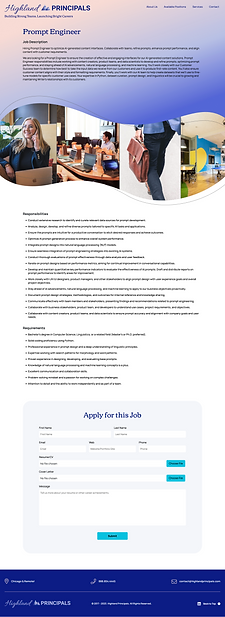
Final Mockups
Through iterations of the Homepage page and Job Positions page, I simplified the sections and created more white space for a clearer and cleaner look.

Accessibility Considerations

Takeaways
Impact:
The Client was left with a modern, simplified website with clear, user-friendly pages. I updated the branding and streamlined the content. The user can now move through the site intuitively and apply to job positions with ease.
What I learned:
While researching and designing the Highland Principals website, I learned that, in some cases, editing out content can actually bring more clarity to the user so that they aren't bogged down with non essential information. Throughout the process, communication with client and receiving feedback is critical as well as interpreting that feedback into a well formed brand, layout and user flow in general.