Upward Path Website
Project Overview
The problem:
Client's wanted the Upward Path website to appear more elevated in it's design and wanted the user to be able to navigate the site with more clarity and enhance the user engagement with content.
Client's goals:
-
Website redesign
-
Elevate the website's appearance and simplify website pages
-
Improve clarity and user navigation; enhance user engagement with content
-
Implementing the client's new branding elements consistently across the website

Before:
-
An outdated website
-
Confusing website layout
-
Inconsistent branding
-
Complex graphics
-
Overly detailed pages
-
Disconnected logos
-
Cluttered and hard to navigate
-
User frustration
-
Dated interface
After:
- A fresh, simplified website
-
Clear, user-friendly pages
-
Cohesive branding throughout
-
Clear and engaging infographics
-
Streamlined content
-
Integrated company logo
-
Well-structured, easy-to-use, and visually captivating site
-
Intuitive and enhanced navigation
-
Contemporary, user-friendly design
My role:
UX designer
Responsibilities:
Designing each website page and creating infographics displaying different focus points of what they offer. Iterating on designs and creating a cohesive outcome throughout the website.
Website:
Understanding the User
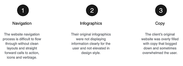
User Research: Pain Points
Starting the Design
Sitemap
Navigation being a central pain point for users, it was key to simplify the sitemap down to what is shown below. Multiple ways to reach important interfaces and calls to action were the central focus in this sitemap structure.

Digital Wireframes
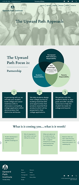
In the initial design phase I utilized hierarchy to show which information was more important for users to see quickly and dividers to help users distinguish areas of content within the website.

Refining the Design
Infographics
The client's original infographic designs did not have clarity and were cluttered and in their old branding style. I designed all the new infographics to be more clear and also utilized the color palette and design elements throughout to bring continuity to the website and a more elevated overall appearance.
Client's Original Infographics


Redesigned Infographics


Mockups
Early mockup designs did not have multiple call to action buttons throughout each webpage. I added those in for more clarity for users. I also utilized the color palette and design elements throughout to bring continuity to the website and a more elevated overall appearance.

Final Mockups
Through iterations of the Approach page and Programs page, it became apparent that there needed to be a clearer division of what the programs offer and it made most sense to create two separate programs pages for each so that there wasn't confusion and cluttered information. Some infographics needed to be simplified and redesigned as well as placed on different pages for more accurate depiction of information.

![student-development-program] - Desktop.png](https://static.wixstatic.com/media/5d092d_07e84e3c28da4afd9184e67f2b6be195~mv2.png/v1/fill/w_269,h_905,al_c,q_85,usm_0.66_1.00_0.01,enc_avif,quality_auto/student-development-program%5D%20-%20Desktop.png)
![college-admissions-program] - Desktop.png](https://static.wixstatic.com/media/5d092d_7afcb051f39c4f09a3ce2ade62b2cd05~mv2.png/v1/fill/w_269,h_877,al_c,q_85,usm_0.66_1.00_0.01,enc_avif,quality_auto/college-admissions-program%5D%20-%20Desktop.png)
Style Guide
The style guide is a collection of all of the styled design elements, fonts and color palette that dictates the final designs.

Accessibility Considerations

Takeaways
Impact:
The Client was left with a fresh, simplified website with clear, user-friendly pages. I kept cohesive branding throughout, created clear and engaging infographics and streamlined content. The user can now move through the site intuitively and have a positive experience while getting all the program information they need.
What I learned:
While researching and designing the Upward Path Website, I learned that there will be many iterations of an infographic before landing on something that is both captivating yet simplified. There may also be the need to not only separate sections clearly but even give them their own pages to ensure the upmost clarity for users. Throughout the process, communication with client and receiving feedback is critical as well as interpreting that feedback into a well formed layout and user flow in general.